Tuesday, 22 October 2013

research


Neville Brody

Neville Brody (fig 1)
Comparing these two images the colours Brody uses are bold and the colours are
random , Brody sends the text off the page, plays with
extreme scaling and runs the text both vertically and horizontally.
 Also, the text in both of these illustrations are treated as shapes rather
 than fonts.
 These images challenge the idea that text has to run left to right, also fonts can
be manipulated into shapes.
 The colour pallet in these are restricted to 2 or 3 and the contrasts in the photos are adjusted.
The simple colour pallet can be utilised in my projects as examples of how two or three
tone images are ideal for stencilling or screen printing

David Carson


In contrast David Carson uses layers and adjustments to opacities, giving a rough and
natural feel to his work. His images appear aged and worn as a result, in opposition to
Brody's bolder approach. They are similar in that they both play with sizes in font and
different fonts for emphasis or subtlety. They also both run their type in any direction.


The above David Carson images give off a particularly tribal feel, they give off emotions of action, the outdoors, youth and rebellion in that some of the text is drawn roughly and without formal structure. The top image is chaotic and the message is nearly lost in the effort to portray energy and movement.

Typographic Portraits

Above and below are examples of typography which explore shapes, colour, positive, space, negative space and texture.
 An example of how photography can be used along side typographic design, pushing the boundaries of what designers see as typography.

Banksy


In my opinion the top image is a social statement about human evolution and how 
fast food is bad for us.
2nd image, a play on words or a pun "bent copper"
The 3rd image is a statement about homelessness and again a play on words but
with actual words this time.
The 4th image doesn't say too much in itself but but still has impact because
 the stencil is very strong, just a few simple shapes, something which can be applied when producing my own craft work.
All of Banksy's work is either political or a social comment on modern life. Most of his stencils use
simple shapes and a limited colour pallet which is also something I'll consider when designing.

Banksy on a kids shirt


The above illustrations demonstrate that this style of work by Ed Hardy appeals to even the very young.


This is more of Ed Hardy's work, he uses imagery that I like to use in my drawings all be it in a more monotone pallet. I believe this style of design would be ideal for my future screen prints and stencil kits for boys in particular.


The above Sex pistols art work, was mostly designed by the sex pistols themselves. They
liked to control their own image using photocopies and torn or cut out text. I think the homemade
appearance might be a good idea for headers for my stencil kits.

Tutorials


http://www.youtube.com/watch?v=R5wW_65iAiU


The above tutorial gave some really good tips on how to draw vector images

Monday, 21 October 2013

experimentation


Clipping mask, Dark brush, Pen tool,and feather

The following projects show how we can apply different textures and patterns
 to images by using masks and the dark pen tool. I also learned how to eliminate
the background by drawing around the subject with the pen tool. I feathered the
edges of the final image to give a more natural appearance.
This demonstrates how I might select only a the portion of the image that I'm
interested in, eliminating the rest and not limiting myself to any given shape or
texture.


All of these images were made in photo shop using a layer mask, the Rhino and Tiger man were made using the hard light setting, but the Woman was created using the difference setting and I decided that it would look better without discarding  the background


Textures and Lighting effects

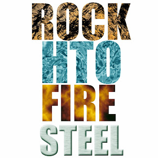
Applying texture to text.

This will be useful when thinking about how a font may not be limited to a flat
colour, demonstrating how a texture can describe the word and it's meaning.
Using clipping masks I learned how to eliminate the surrounding texture revealing
only the text.


Steel

Noise and Gaussian blur, motion blur, clipping mask, Select text, fill background black, adjust layer styles for bevel etc.

Fire

Render clouds, difference clouds, Gradients black-red-orange-yellow. Type "fire", create clipping mask, adjust layer styles

Water  

render clouds, add noise, filter-gallery-chrome. Distort to twirl slightly, adjust colour balance. Type "H2o", clipping mask.

Rock

Render Clouds, add noise. Create new channel, render clouds. Lighting effects, adjust the height in new channel.


Famous quotes using some of the above effects

After looking at some of Neville Brody and David Carson's work I came up with a few designs of my own.


 The circles have a cloud filter interrupted by square negative spaces, the background is a subtle cloud texture. I've played with the scale in the text and quotation marks. I've used two different fonts


close blend of colours, reflection and a subtle texture heighted in lighting effects for the type.


This image is my interpretation of Neville Brody's (see research fig 1), Filter-large tiles, different orientation in text, playing with scale and transform.


See research (fig 2) I kept the monotone similar to Brody, the background is from a wood textured photo, overlaid with an ink splatted scan. I played with the text in Illustrator by adjusting the anchor points, then mirrored the text. The photo was inverted and the lightness and contrast was adjusted. I changed the "W" in own to red so as to draw attention to that area and making it stand out.


Masks for typographic portraiture

more masking techniques, which if used for future designs could make a
printable T-shirt design or stencil. Separating mid-tones and highlights identifies
a way of making a simple three colour design ie: background colour, white and black.


Technique

Select a screen shot with good contrast between dark and light tones, open in photo-shop.
Select, colour range, choose shadows in a new layer, then mid-tones in a new layer. Add a new layer filled with white. Make a brush with the appropriate text. Paint the portrait using the new brush.


 Screen shot, colour range, select shadows. repeat and select mid-tones. Add layer fill with white. Text layer-define brush. delete text layer. The lips in Madonna are also defined as a brush

Crafting a stencil design

The following project uses photo-shop to bring in an image and by adjusting the
contrasts and filtering to a cut out, I've defined three separate tones. This can
be useful when designing a screen print or stencil as it gives me another technique
to utilise.
Photoshop, impose kkk hat onto bulldog, gray scale, filter gallery-cut out. Adjust brightness and contrast. Make a print.


Trace the image and cut a stencil keeping the gray and black . .

as separate stencils


final image

Although the image came out quite well, because the stencil colour separation was not
done in one piece it was not as neat as I would have liked. In the future I will make sure
that the colour separations are cut out of one piece

Texture rubbings

The following images are pencil rubbings from various surfaces, they can possibly be
incorporated into screen printing ideas.


Screen printed T-shirt ideas


 Clown skull is a drawing I did with T-shirts in mind, I drew it in ink then added the swirls in
Illustrator.

Another drawing which I made for a t-shirt design